Hi again. Following up on my previous Vancouver technical writer entry about 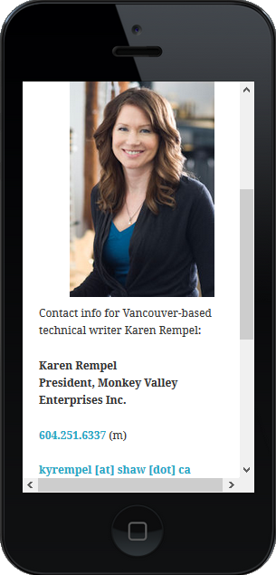 mobile web design, here are some new tips for mobile-friendly web design:
- Use a stylesheet that re-sizes content based on the viewer size. As I mentioned in my last post, a current theme like WordPress Twenty Fifteen is set up to re-size for every common viewer size.
- Use phone tags for phone numbers:
<a title=“Call me” href=
“tel://+16042516337”>
604.251.6337</a> (m)
Result: 604.251.6337 (m)
This allows the user to tap your phone number and call you, even in browsers that don’t automatically convert phone numbers to a clickable link.
- Use a high-contrast colour for links, with enough space around links for people to be able to tap the link they want. Re-write or re-format to avoid crowding links together.
- Put a Back to Top link at the bottom of long pages or entries, so people don’t have to scroll back up.
- Use a simulation tool like MobileTest.me to view your website on different mobile devices.
- Also remember to test your site in the top browsers, like Chrome, FireFox, Safari, and IE.
Whether you are looking for a technical writer consultant or contractor for work in Vancouver or another location, this website serves as a Portfolio sample of mobile design in action! Also check out my Resume page if you are looking for technical writer resumes or CVs.