New York Technical Writer’s Information Interview Service Sweeps Across the Continent

STC Pacesetter AwardI’ve written previously about the Information Interview Service that I created for the STC’s Canada West Coast chapter. Our chapter won a Pacesetter Award for this service, which pairs aspiring technical writers with experienced technical writers. I published an article about this service in Intercom, the professional technical writing journal of the STC, and both the New York Metro chapter and the Chicago chapter implemented similar services. So now if you would like to talk to a senior technical writer about what is involved in joining our technical writing profession, you have three choices:

BTW, the New York Metro chapter also won a Pacesetter Award for their Talk to a Professional service, and the Chicago chapter won a Pacesetter Award the year they implemented their service as well. I am delighted that my idea bore such wonderful fruit for technical writers across the continent!

Back to Top

New York Technical Writer Converts to Twenty Sixteen

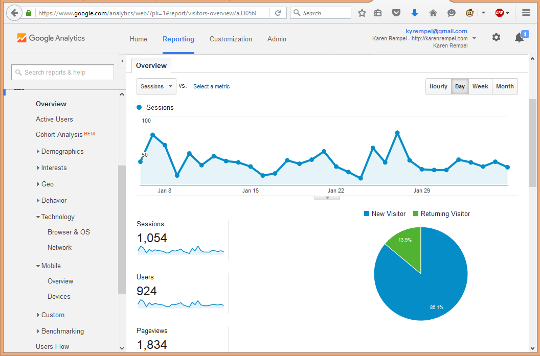
Google Analytics for WebsiteYou might notice my top-ranking Vancouver technical writer site looks a little different today. I updated to the WordPress twentysixteen theme. You may recall I gave an enthusiastic shout-out to WordPress last May, when I updated my site to use the twentyfifteen theme. I still think WordPress is awesome, and it would appear that website builders the world over agree with me. As of today’s date (February 6, 2016), 59.1% of websites in the world use WordPress, according to W3Techs.

It was a snap to make the change, taking about 2 hours total to select the theme, install it, create a few graphics in the right size, and make a few minor formatting tweaks. I added my own copyright information to the footer, customized the link font colour, and changed the font size for the tags in the left column. This is an amazing accomplishment (on the part of their coders to make the task so easy), and I am very appreciative of the service that WordPress provides for free to the world computing community.

I made these changes using a combination of the user-friendly WordPress editing platform and direct coding in the .php and .css files.

While I was at it, I took a look at my Google Analytics for the site. I thought it would be fun to compare the stats from the past month to the stats I reported in May 2015:

Device May 2015 Feb 2016
Desktop 918 – 92% 936 – 89%
Mobile Phone 70 – 7% 92 – 9%
Tablet 15 – 1% 26 – 2%
Total Visitors 1,003 1,054

The table above shows that the percentage of mobile users has increased slightly. Still, the majority of people who searched for a technical writer used their desktop computer, which makes sense. I imagine people would prefer to do this at work, not while lounging on the beach!

Browser May 2015 Feb 2016
Chrome 729 702
FireFox 115 127
Safari 72 108
Internet Explorer 31 90
Other 56 27
Total Visitors 1,003 1,054

No changes in the browser pecking order either, though the use of Internet Explorer did increase significantly.

I welcome your thoughts on the new site design. Drop me a line!

Back to Top

Save

New York Technical Writer Mounts Shadow Play Art Exhibit

Fellow technical writer Jon Steeves standing in front of Shadow Play, 7'x 9', ink on canvas
Fellow technical writer Jon Steeves standing in front of Shadow Play, 7’x 9′, ink on canvas

It might seem like a bit of a leap, from left-brain technical writing to right-brain visual art. But somehow I made the leap across the corpus callosum, and I had my first art exhibit in August, at the Havana Art Gallery on Commercial Drive in Vancouver. The exhibit ran from August 6 to 19, with the opening night reception on August 9. It was a smashing fun night, and I took the art to the next level in this 5-minute video I made of the event.

I used Camtasia Studio, with footage and photos recorded on my iPhone 5S. The remix of Gary Numan’s “You Are in My Vision” was something Miguel Wisintainer created, and I love the way the lyrics go with the people’s morphing faces. A true celebration of the love and caring I felt as my friends and family came to look at my artwork and see how it impacted them. Can you guess how many technical writers are in the video? Drop me a line and you will win a prize if you guess right!

To see close-ups of the artwork, check out my BC Wilderness Visions blog.

Back to Top

Save

Save

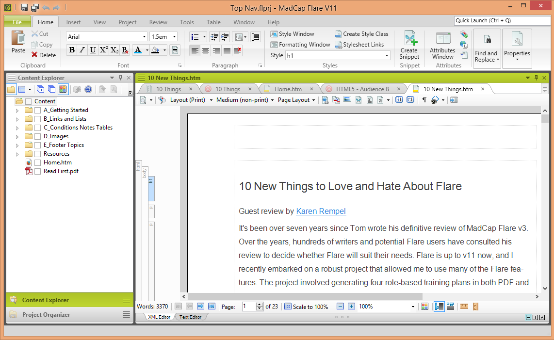
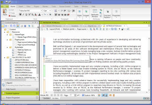
New York Technical Writer Publishes MadCap Flare 11 Review on I’d Rather Be Writing

MadCap Flare User Interface
I am pleased to announce a collaboration with California-based Tom Johnson of I’d Rather Be Writing. In 2008, he wrote a definitive review of MadCap Flare v3 that has helped countless technical writers and prospective users of MadCap Flare. BC Hydro logoSince I had the pleasure of doing a recent MadCap Flare project for BC Hydro in Vancouver, we agreed that I would update his review and add some insights on MadCap Flare 11.

Back to Top

Save

Save

New York Technical Writer Knows Mobile-Friendly Web Design

Hi again. Following up on my previous Vancouver technical writer entry about iPhone 5 Simulation with phone number link - Karen Rempel Vanccouver technical writermobile web design, here are some new tips for mobile-friendly web design:

  • Use a stylesheet that re-sizes content based on the viewer size. As I mentioned in my last post, a current theme like WordPress Twenty Fifteen is set up to re-size for every common viewer size.
  • Use phone tags for phone numbers:

<a title=“Call me” href=
“tel://+16042516337”>
604.251.6337</a> (m)

Result: 604.251.6337 (m)

This allows the user to tap your phone number and call you, even in browsers that don’t automatically convert phone numbers to a clickable link.

  • Use a high-contrast colour for links, with enough space around links for people to be able to tap the link they want. Re-write or re-format to avoid crowding links together.
  • Put a Back to Top link at the bottom of long pages or entries, so people don’t have to scroll back up.
  • Use a simulation tool like MobileTest.me to view your website on different mobile devices.
  • Also remember to test your site in the top browsers, like Chrome, FireFox, Safari, and IE.

Whether you are looking for a technical writer consultant or contractor for work in Vancouver or another location, this website serves as a Portfolio sample of mobile design in action! Also check out my Resume page if you are looking for technical writer resumes or CVs.

Back to Top

Save

New York Technical Writer Updates to Twenty Fifteen

Vancouver Technical Writer Karen Rempel Updates Websites to WordPress Twenty FifteenThanks for visiting my revised website! Hi, I’m Karen Rempel, a Vancouver-based documentation specialist and senior technical writer.

I just updated this website to be mobile-friendly using the fantastic WordPress theme Twenty Fifteen. I also updated my BC Wilderness Visions website, using the same theme but different settings. Check it out to see the striking effects that can be achieved by simple colour changes.

I want to give a big shout-out to WordPress for this awesome theme. It only took me a day to update both websites to use this theme. I was previously using Silver Light by Blog Oh! Blog. I loved this theme and didn’t want to change, but Google forced me into action by notifying me that my Google ranking would slip if I didn’t make my site resizable for mobile phones and tablets. What can you do?

I checked out my Google Analytics for the past month, and found that of the 1000+ visitors to this technical writing website:

  • 918 used desktops. This is what I thought! My clients are typically at their desk at work when they think about their need for a technical writer, do a search, and call me.
  • 70 used their mobile phones.
  • 15 used their tablets.
Technical writers bridge people and technology

Technical writers bridge people and technologySo isn’t it interesting that people use technology to find technical writers? Most of my clients find me by searching on the internet. And thanks to Google Analytics, I know which devices they use, what countries they search from, and even what browser they use!

Here are the stats for browsers used to find this technical writing website:

  • Chrome – 729
  • FireFox – 115
  • Safari – 72
  • Internet Explorer – 31

Please drop me a line to let me know what you think of the new site! And if you like, tell us what device and browser you used to get here. 🙂

Back to Top

New York Technical Writer Leads Super Shoreline Cleanup

East Van Pickers with trash
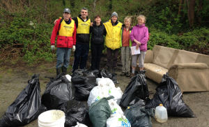
East Vancouver Pickers with 19 bags of trash

Yesterday I met with a group of friends—oddly enough, none of these bunch are technical writers—to participate in the Great Canadian Shoreline Cleanup. Our group of 6 people picked up trash on a Vancouver shoreline for 2 hours and these are the amazing results:

  • 570 food wrappers
  • 1,074 takeout containers, cups, lids, bottles, cans, and utensils
  • 432 plastic bags and pieces of packaging
  • 1,120 pieces of tiny trash (1 inch or smaller)
  • 19 bags of trash (91 Kg or 200 lbs)
  • Additional furniture, construction waste, and large items totalled another 113 Kg or 250 lbs
  • Total items picked up: 3,592 pieces of trash
  • Total trail length cleaned up: 2.2 KM

For more details, see the full story on my BC Wilderness Visions blog. Thanks to my awesome friends for coming out on a Saturday morning to help make the world a more beautiful place.

Back to Top

Save

Save

New York Technical Writer Advises Using MadCap Flare Content Management for Customized Resumes

MadCap Flare WindowI recently completed a technical writing project for a Vancouver- and Calgary-based client who is a management consultant, program manager, and project manager in IT. Like many consultants, he has worked in a range of industries, and with over three decades’ worth of experience, he faces the challenge of condensing his experience and skills into a 3-page resume targeted to clients in two provinces. What would be a good way to solve this challenge? Enter MadCap Flare.

[Click the graphic to see a larger view that shows the use of condition tags]

Often thought of as an online help authoring tool, MadCap Flare is also a very user-friendly content management system (CMS). It provides a wide range of online and print-based output options (for example, Word, PDF, html). It uses XML as the backbone, making it easy to import source content and play nicely with most of the industry-standard authoring tools on the market today.

I thought that MadCap Flare’s CMS capabilities could help solve my client’s problem by providing a single-source database of skills and experience from which he can output a role- or industry-specific resume with one or two clicks of the mouse. In the words of our beloved Captain Jean-Luc Picard, I made it so.

I imported my friend’s main resume from Word, and then added in content from five other role-specific resumes, with conditional tags indicating which content belonged on which resume or CV. I set up two different style sheets, for two different looks – executive dark blue, and executive brown. I set up variable text for his phone, email, and mailing address, so he can select which of these to use on a given resume for a particular client. Then I created target outputs for nine different resumes. Et voila!
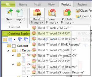
Target Options in MadCap FlareAll my client has to do is click Build Primary and then select the resume he wants to generate. But best of all, updating his resume with new experience is a snap. He can use MadCap Flare’s intuitive XML editor to type in new content, then apply conditional tags to specify which resume the content belongs with. Then simply use those same two mouse clicks to generate his new target resume. Beautiful. As you can tell, I am a fan of the Flare!

Of course, MadCap Flare isn’t cheap—a perpetual license is over $1,000 CAD (including tax). But for professionals who are aiming for top-paying consulting jobs, it is a reasonable career investment, and a tax write-off. If you are interested in creating your own database of role-oriented, industry-specific resumes, give me a call and I will be happy to help you.

Back to Top

Save

New York Technical Writer Provides Corporate Sponsorship for Yoga Outreach

Yoga OutreachAfter 10 years of teaching yoga on a part-time and volunteer basis—as a refreshing addition to my desk-bound technical writing gig—I have decided to retire my mat. Although my appreciation of the value of yoga has not changed, its popularity has grown enormously in the past 10 years and there are now hundreds of excellent yoga teachers in New York and Vancouver. I’ve therefore taken down my Yoga for the Office page on this website.

In the past I taught yoga as a volunteer through Yoga Outreach. I taught youth in prison, and also people who are recovering from drug addiction. I continue to support the wonderful outreach work of this organization through a corporate sponsorship. I sponsor a weekly program at New Dawn, an addiction recovery treatment program offered by the Chrysalis Society. Yoga classes are one component of their unique, effective approach to assisting women to deal with addiction. Yoga Outreach brings a pioneering trauma-sensitive approach to teaching yoga that makes yoga an accessible, effective resource.

Back to Top

Save

New York Technical Writer Teaches Simultaneous Desktop and Mobile Design

Dolphin Celebration - Esalen Relaxation Massage VancouverI recently launched a new website for a Vancouver- and New York-based technical writing client. I designed and created the site using the WordPress theme Twenty Fourteen, which has been optimized for desktop, tablet, and mobile phone. Twenty Fourteen reorganizes the display of page elements based on the screen size of the device you are using. In contrast, the theme for this karenrempel.com technical writing website, Silver Light by Blog Oh! Blog, was developed in 2008 and does not resize on the fly. [Note: I updated karenrempel.com to a mobile-friendly format in April 2015.]

But there’s more to designing for mobile devices than just the capacity to automatically adjust the page elements. Here are some tips about mobile design for technical writers:

  • Keep the number of menu items to 6 or less. This is the maximum that can be displayed without scrolling on an iPhone.
  • Don’t use submenus. They are shown in expanded view when you open the menu on a tablet and present the reader with an overwhelming number of choices.
  • Use center alignment for graphics. Left or right alignment with text wrap leaves a column that’s too narrow for displaying text elegantly.
  • Put the phone number and action links near the top of the home page. Imagine your user is stopped at a light and wants to find the info before the light turns green! Not that anyone looks at their phone while driving, of course.
  • Launch all top-priority pages from links in the home page.

Whether you are a technical writer designing a website for a client, or designing your own technical writing website, I hope these tips will help you design a site that’s effective—both visually appealing and functional—on any device.

Back to Top

Save